
About Althaf Hussain
Althaf Hussain is the CEO and Founder of iDesign Advertising LLC, one of the UAE’s leading signage and advertising companies, established in Dubai in 2015. With 11+ years delivering signage projects in the UAE signage and advertising industry, Althaf has built iDesign into a trusted partner for businesses across Dubai, Sharjah, Abu Dhabi, and the wider GCC — including Saudi Arabia, where the company operates from its Riyadh office.
Related Posts

May 23, 2026
Indoor vs Outdoor LED Screen in Dubai: Which Is Right for Your Business?
Indoor vs Outdoor LED Screen Dubai | Which Is Best for Business? Written by: Althaf…
April 17, 2026
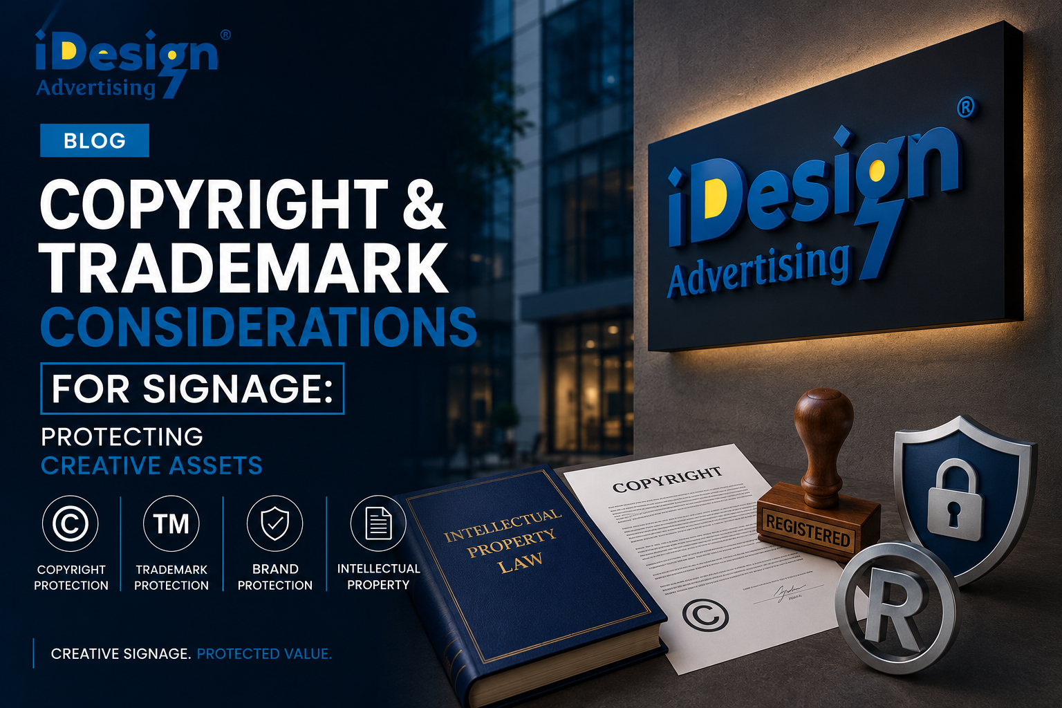
Copyright and Trademark Considerations for Signage: Protecting Creative Assets
Copyright and Trademark Considerations for Signage: Protecting Creative Assets Written by: Althaf Hussain, CEO &…

September 29, 2025
The Best Signage Company in Dubai: Key Features to Look For
On a warm evening in Dubai, Amal, a young entrepreneur, stood outside her soon-to-open boutique…